- Published on
How to import SVGs as React components in your Sitecore Next.js Application
- Authors

- Name
- Ben Sewards
- @BenjaminSewards
The Basics
We can transform SVGs into React components for better reusability and styling transformations (strokes, fills, etc.) through the use of the react-svgr plugin.
The Next.js getting started guide gives us the baseline configuration required to exclude all Webpack test rules for svg extensions.
module.exports = {
  webpack(config) {
    // Grab the existing rule that handles SVG imports
    const fileLoaderRule = config.module.rules.find((rule) =>
      rule.test?.test?.('.svg'),
    )

    config.module.rules.push(
      // Reapply the existing rule, but only for svg imports ending in ?url
      {
        ...fileLoaderRule,
        test: /\.svg$/i,
        resourceQuery: /url/, // *.svg?url
      },
      // Convert all other *.svg imports to React components
      {
        test: /\.svg$/i,
        issuer: /\.[jt]sx?$/,
        resourceQuery: { not: /url/ }, // exclude if *.svg?url
        use: ['@svgr/webpack'],
      },
    )

    // Modify the file loader rule to ignore *.svg, since we have it handled now.
    fileLoaderRule.exclude = /\.svg$/i

    return config
  },

  // ...other config
}
Working with Next.js Plugins in a Sitecore Application
The Sitecore Next.js template contains the typical next.config.js file, but abstracts away "plugin" architecture. A plugin is considered any modification to the next.config, including Webpack overrides, in a clever way.
module.exports = () => {
  // Run the base config through any configured plugins
  return Object.values(plugins).reduce((acc, plugin) => plugin(acc), nextConfig);
};
The setup above will generate an array of plugins from /lib/next-config/plugins and use the JS reducer function to accumulate those plugin file returned objects on the base nextConfig within the same file.
The SVGR Setup
Let's go ahead and create the svgr.js plugin under /lib/next-config/plugins and follow the Sitecore architecture to apply a webpack entry:
/**
 * @param {import('next').NextConfig} nextConfig
 */
const svgrPlugin = (nextConfig = {}) => {
  return Object.assign({}, nextConfig, {
    webpack: (config, options) => {
      // Grab the existing rule that handles SVG imports
      const fileLoaderRule = config.module.rules.find((rule) => rule.test?.test?.('.svg'));

      config.module.rules.push(
        // Reapply the existing rule, but only for svg imports ending in ?url
        {
          ...fileLoaderRule,
          test: /\.svg$/i,
          resourceQuery: /url/, // *.svg?url
        },
        // Convert all other *.svg imports to React components
        {
          test: /\.svg$/,
          issuer: /\.[jt]sx?$/,
          // resourceQuery: /react/,
          resourceQuery: { not: /url/ }, // exclude if *.svg?url
          use: ['@svgr/webpack'],
        }
      );

      // Modify the file loader rule to ignore *.svg, since we have it handled now.
      fileLoaderRule.exclude = /\.svg$/i;

      if (typeof process.env.WEBPACK_DUMP !== 'undefined') {
        console.log(config.module.rules);
      }

      // Overload the Webpack config if it was already overloaded
      if (typeof nextConfig.webpack === 'function') {
        return nextConfig.webpack(config, options);
      }

      return config;
    },
  });
};

module.exports = svgrPlugin;
Some Caveats
From the above plugin, I've included the use of an optional env variable process.env.WEBPACK_DUMP. When this env variable is set (mainly locally through the package.json script), it will log the current Weback rules applied at time of running this plugin. This log will help aid in finding any Webpack rules that may be hijacking the use of the svg extension, such as the next-image-loader. When this plugin code is applied, the use: next-image-loader rule will now contain the exclude: .svg property.
To get these changes applied in a Local Container environment, you must restart the rendering service so that the entrypoint (ex: npm run start) is re-ran with the updated next.config.js file. I spent countless hours changing the extension rules around and generating a dump of the Webpack file only to find out that my changes were not actually being applied.
If you'd like further debugging or would just like to review what the Webpack loaders actually consist of during a build, place the following in your next.config.js file and run npm install webpack-config-dump-plugin:
/**
 * @type {import('next').NextConfig}
 */
const nextConfig = {
    // ...other properties

    webpack: (config) => {
    // if you need to review the entire built webpack config, enable this env variable
    if (typeof process.env.WEBPACK_DUMP !== 'undefined') {
      config.plugins.push(
        new WebpackConfigDumpPlugin({
          depth: 10,
          outputPath: './',
        })
      );
    }
    return config;
  },
Creating a Sample Icon System Component
Create the SVG import types first
In order to pass the eslint type import check, first create /@types/index.d.ts with the following global module types:
declare module '*.svg?url' {
  const src: string;
  export default src;
}

declare module '*.svg' {
  import { ComponentType, SVGProps } from 'react';
  export const ReactComponent: ComponentType<SVGProps<SVGSVGElement>>;

  const src: string;
  export default src;
}
The first declaration will be for importing SVG files into react tsx files with the ?url parameter and exposes a single string property, src, in case you still need to render an SVG using next/image.
The second declaration is for our SVGR use case of importing an SVG and using it as a React Component.
Create the Icon System Component
The React component below simply renders SVG files as React components, but also leverages the Bootstrap generated CSS variables to set the fill property at the parent level, which cascades down into each SVG and changes the color of the SVGs to whatever we want, such as a CMS managed value.
import AppIcon from 'public/static-assets/svg-icons/app.svg';
import CalendarIcon from 'public/static-assets/svg-icons/calendar.svg';
import CaratIcon from 'public/static-assets/svg-icons/carat.svg';
import ChatIcon from 'public/static-assets/svg-icons/chat.svg';
import { useEffect } from 'react';
const IconSystem = (): JSX.Element => {
useEffect(() => {
console.log(AppIcon);
}, []);
return (
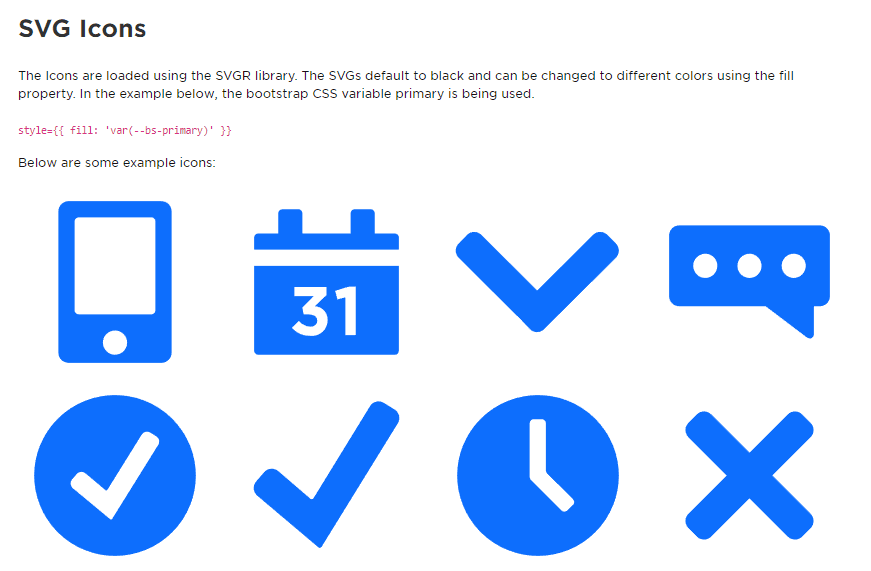
<section style={{ fill: 'var(--bs-primary)' }}>
<h2>SVG Icons</h2>
<p>
The Icons are loaded using the SVGR library. The SVGs default to black and can be changed to
different colors using the fill property. In the example below, the bootstrap CSS variable
primary is being used. <br />
<br />
<code>{"style={{ fill: 'var(--bs-primary)' }}"}</code>
</p>
<p>Below are some example icons:</p>
<div className="row">
<div className="col">
<AppIcon className="icon--test" />
</div>
<div className="col">
<CalendarIcon className="icon--test" />
</div>
<div className="col">
<CaratIcon className="icon--test" />
</div>
<div className="col">
<ChatIcon className="icon--test" />
</div>
</div>
</section>
);
};
export default IconSystem;
If you'd like to control the SVG colors like above, make sure to have a global CSS/SCSS selector that defaults the svg fill to currentColor so that it gets replaced with an inherited fill:
svg {
  fill: currentColor;
}
This can also be configured directly in the SVG file itself, but since the SVGR plugin is ran through a clean tool called SVGOMG, it may get stripped out and would have to be accounted for in the SVGR webpack configuration options.